Outbound Marketing Agency
Outbound Marketing Agency
Increase in overall Conversion Rate, from 1% to 1.4%
Conversion Rate on redesigned product pages
This renowned organic beauty brand merges ancient Ayurvedic wisdom with modern natural technologies to create high-quality skincare and haircare products. Despite attracting a significant amount of website traffic, the brand faced a critical challenge: their conversion rate was stuck at 1%. The goal was clear—improve the user experience and increase conversions while maintaining the brand’s strong ethical and quality reputation
During the initial stages of the project, we quickly discovered the challenge wasn’t in attracting visitors, but in convincing them to convert. The website was receiving a large volume of traffic, but only 1% of these visitors were making purchases. This posed a major issue for a brand that prided itself on offering premium products with proven results.
Our deep dive into the website revealed several issues that were hampering conversions:
Lack of Trust Signals: Despite offering high-quality, organic products, the landing pages didn’t effectively communicate credibility. Critical elements like expert endorsements, visual testimonials, and trust badges were missing, creating hesitation in a wellness-focused industry where trust is paramount.
Unclear Product Benefits: The product descriptions were comprehensive, but the benefits were not immediately clear or easily consumable. Visitors were left having to sift through information, which made decision-making harder.
Ineffective “How to Use” Section: Although the product pages featured a “How to Use” section, it was buried in a text-heavy accordion. Visitors were either missing this key information or found it too overwhelming to navigate.
No Persistent Call-to-Action: The lack of a sticky add-to-cart button meant users had to scroll back up to make a purchase decision, which often led to distraction and cart abandonment.
We knew that solving these issues would require not just design changes but a deep understanding of the customer’s mindset.
Through competitor analysis and page audits, we identified the gaps. Our findings were clear: customers wanted reassurance before making a purchase—especially when it came to wellness products. They needed to trust both the product and the brand. We decided to enhance the customer journey with strategic adjustments.
Enhancing Trust and Credibility
To build trust, we incorporated expert opinions on the products themselves, ranging from well-known celebrities, doctors, and beauty consultants. We also added customer reviews with images, which gave visitors social proof of the product’s effectiveness. Pinned reviews addressing common customer concerns, along with trust badges highlighting the number of satisfied customers, further solidified this trust.
Improving Product Benefit Clarity
We simplified the presentation of product benefits. Instead of dense paragraphs, we distilled the benefits into bullet points and short, impactful sentences that quickly conveyed the value. This reduced cognitive load and helped visitors see why these products were worth purchasing at a glance.
Revamping the “How to Use” Section
The original “How to Use” section was hidden in an ineffective text accordion. We revamped this into an easy-to-read section using icons and concise, visually appealing content. This made the instructions far more engaging, allowing potential buyers to quickly understand how to use the products without feeling overwhelmed.
Sticky Add-to-Cart for Seamless Purchasing
We implemented a sticky add-to-cart button that remained visible as customers scrolled through the page. This simple change made it easier for users to commit to a purchase at any point, preventing distractions and improving cart completion rates.
Reducing Perceived Risk with Clear Shipping Information
We also added a shipping badge directly below the add-to-cart button to eliminate any uncertainty regarding delivery costs and timelines, reducing perceived risk and encouraging purchase confidence.
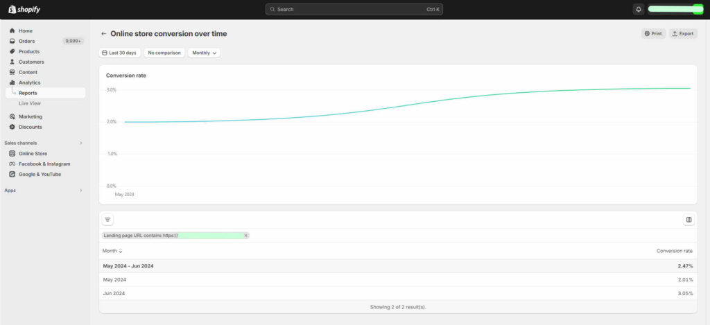
The impact of these changes was immediately noticeable. The redesigned product pages saw a significant conversion lift from 1% to 3%, an astounding 3x increase. This, in turn, raised the overall site conversion rate from 1% to 1.4%, marking a substantial improvement in the brand’s ability to turn traffic into sales.
Encouraged by this success, the brand adopted the same approach across all product pages, leading to sustained improvements in their conversion rate and revenue.