Outbound Marketing Agency
Outbound Marketing Agency

Trunativ, a leader in nutritional products, sought expert insights to optimize the user experience on their Everyday Sweet product detail page (PDP). They wanted to understand where subtle improvements could be made to enhance customer engagement and simplify the purchasing journey.
While the existing product page provided a solid foundation, it lacked certain elements that could improve usability and reduce friction for customers. Our task was to evaluate the page and identify key areas for improvement, particularly focusing on cognitive overload, product variation selection, and the overall clarity of the purchasing process.
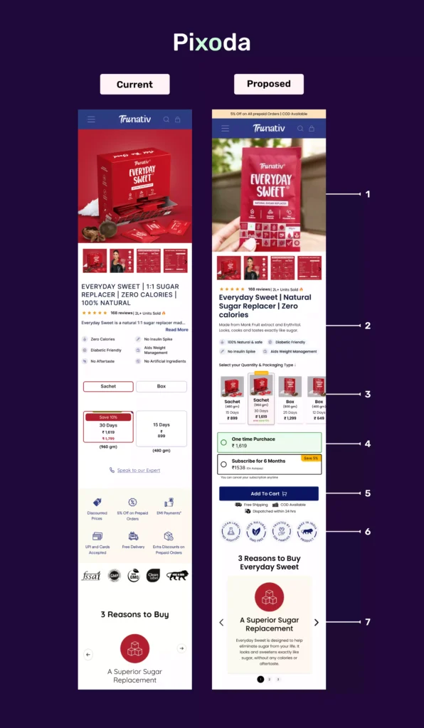
Through a detailed analysis, we identified several enhancements to streamline the user experience and offered recommendations for Trunativ to consider:
Thumbnail Images: We recommended adding use case images (e.g., pouring the sachet into a drink) to help customers visualize product use, improving engagement.
Product Description: We suggested removing the ‘Read More’ button and redundant information, allowing for a more streamlined and concise presentation of product details, reducing cognitive overload.
Product Variation Selector: We proposed a card-style layout to display all product variations clearly, simplifying the selection process for users.
Purchase Options: We recommended offering subscription options alongside one-time purchases to increase customer retention, particularly for returning customers.
Sticky Add-to-Cart: We advised modifying the sticky add-to-cart button to display selected product details and pricing, reducing the likelihood of confusion and increasing checkout completion rates.
Trust Badges: We recommended streamlining trust badges, organizing them by relevance, and removing any unnecessary badges that could distract from the purchasing decision.
Cards and Tabs: We suggested using cards and tabs to organize content, making it easier for users to navigate and digest product information.
Glucose Spike Comparison: We recommended adjusting the layout of the comparison graphs into a side-by-side format for better clarity and easier decision-making.
Our recommendations provided Trunativ with a clear strategic roadmap for optimizing the Everyday Sweet product page. The proposed changes were designed to significantly enhance user experience, streamline the decision-making process, and ultimately boost conversions by reducing friction in the purchasing journey. These insights laid the foundation for Trunativ to implement impactful improvements at their own pace, ensuring long-term success.